Master Thesis
University of Regensburg, Germany (2016)
Aesthetic Evaluation of Websites – An Empirical Comparison Study on Responsive Design
Final grade: 1.1
Aesthetic Evaluation of Websites – An Empirical Comparison Study on Responsive Design
Final grade: 1.1
Aesthetic Evaluation of Websites – An Empirical Comparison Study on Responsive Design
Final grade: 1.1
Beside content and usability visual aesthetics represent an important factor of the perceptual organization of websites. Various studies show that website aesthetics turn out to be a decisive factor, if other characteristics of websites (e.g. usability, content) are similar or equal (Thielsch, 2008a, p. 36). Whereas in former times the desktop-PC was the primary device viewing a website, nowadays the variety of mobile devices like tablets or smartphones providing Internet access is growing.
In order to provide a good user experience (UX) on all devices, website owners increased the use of so-called respsonsive websites, which adapt the layout automatically to the viewing environment. Therefore the question arises, how the aesthetic demand of a website can be preserved, when using responsive layouts. In an empirical study with 60 subjects it was examined whether and, if so, to what extent the aesthetic grace of responsive websites viewed on the most common devices (desktop-PC/notebook, tablet, smartphone) differs concerning the first impression and the overall evaluation.
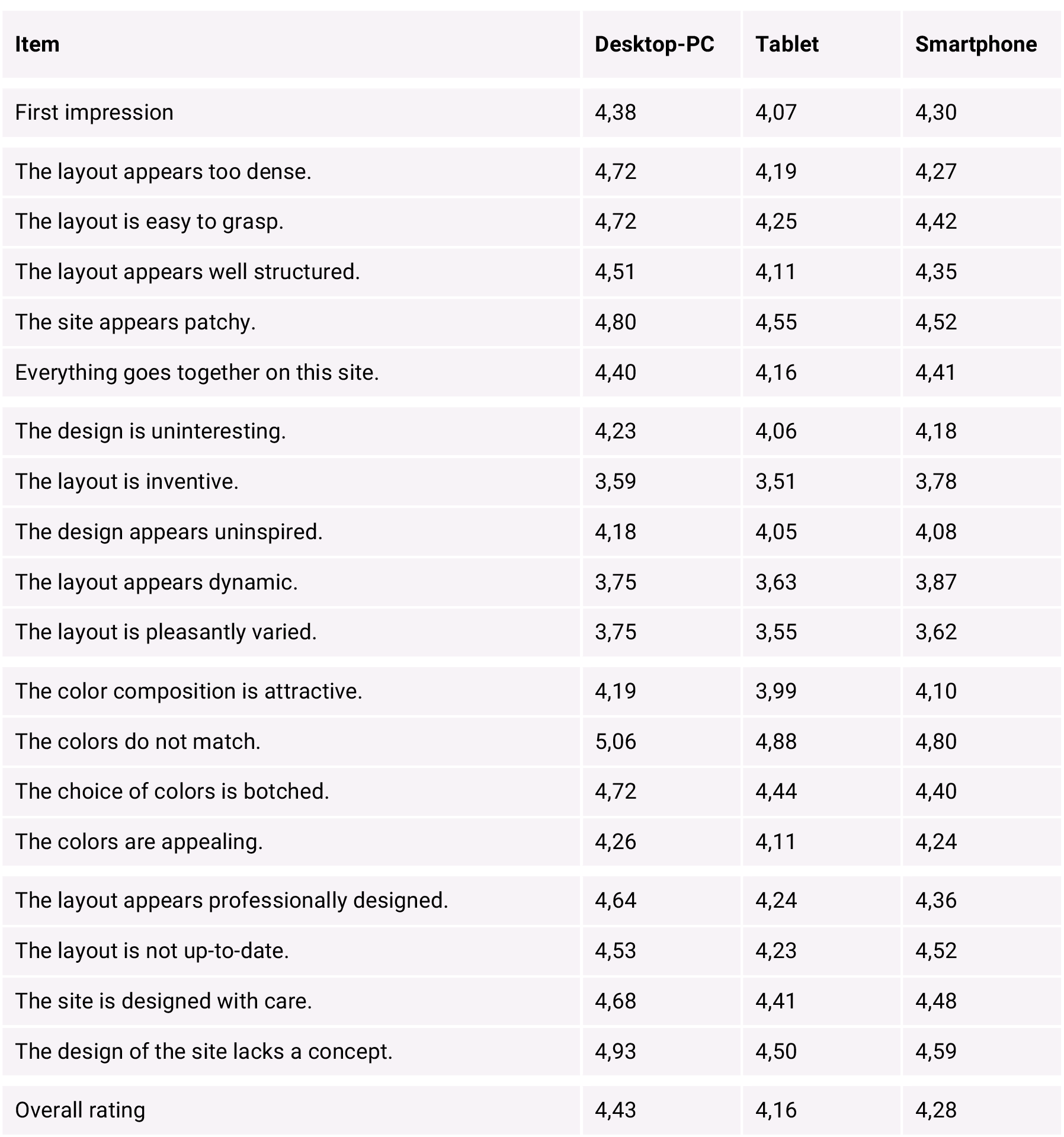
By using the VisAWI-questionnaire created and evaluated by Moshagen & Thielsch 20 responsive websites of German universities were evaluated by a total of 60 participants (20 participants per device). The results show significant distinctions between the studied groups.
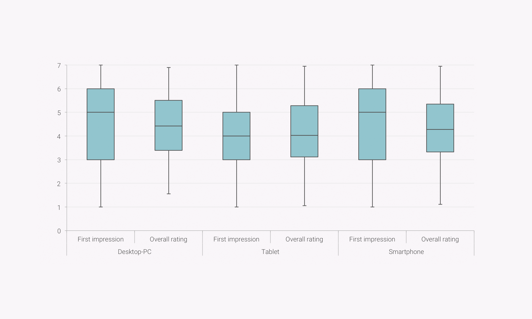
Boxplot presentation of the website's first impression and the overall rating on Desktop-PC, Tablet and Smartphone
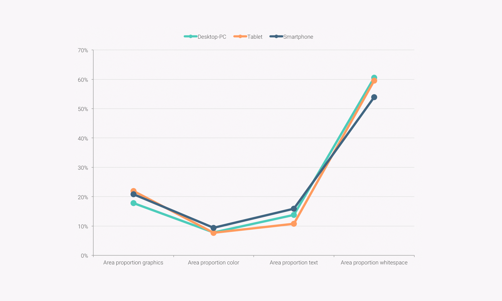
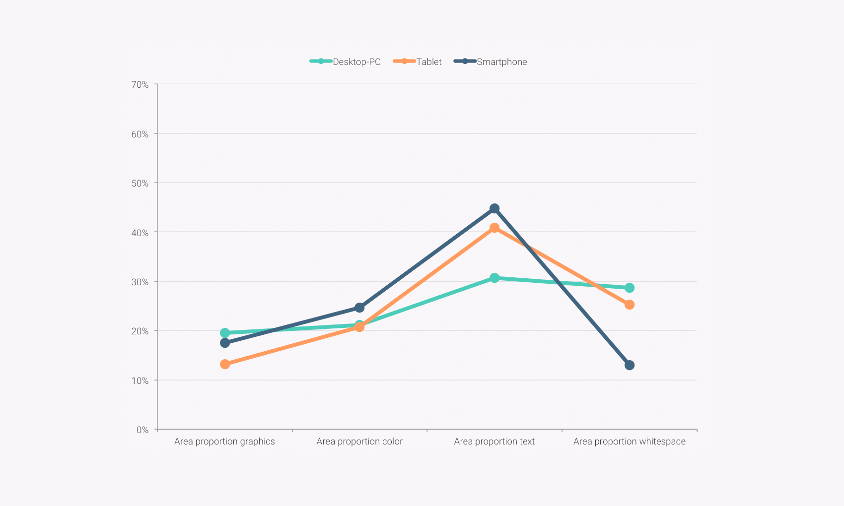
Against expectations that bigger displays imply higher ratings, tablet versions of websites tend to have lower overall evaluations. Responsive websites viewing on a desktop-PC show the best results. In order to determine reasons and recommendations for good web design an additional qualitative analysis investigated the best and the worst rated websites. It was found that a sufficiently high proportion of whitespace, a modest use of colour and a higher proportion of pictures and graphics compared to the proportion of text seem to have a positive impact to the overall evaluation of a website.
Against expectations that bigger displays imply higher ratings, tablet versions of websites tend to have lower overall evaluations. Responsive websites viewing on a desktop-PC show the best results. In order to determine reasons and recommendations for good web design an additional qualitative analysis investigated the best and the worst rated websites. It was found that a sufficiently high proportion of whitespace, a modest use of colour and a higher proportion of pictures and graphics compared to the proportion of text seem to have a positive impact to the overall evaluation of a website.
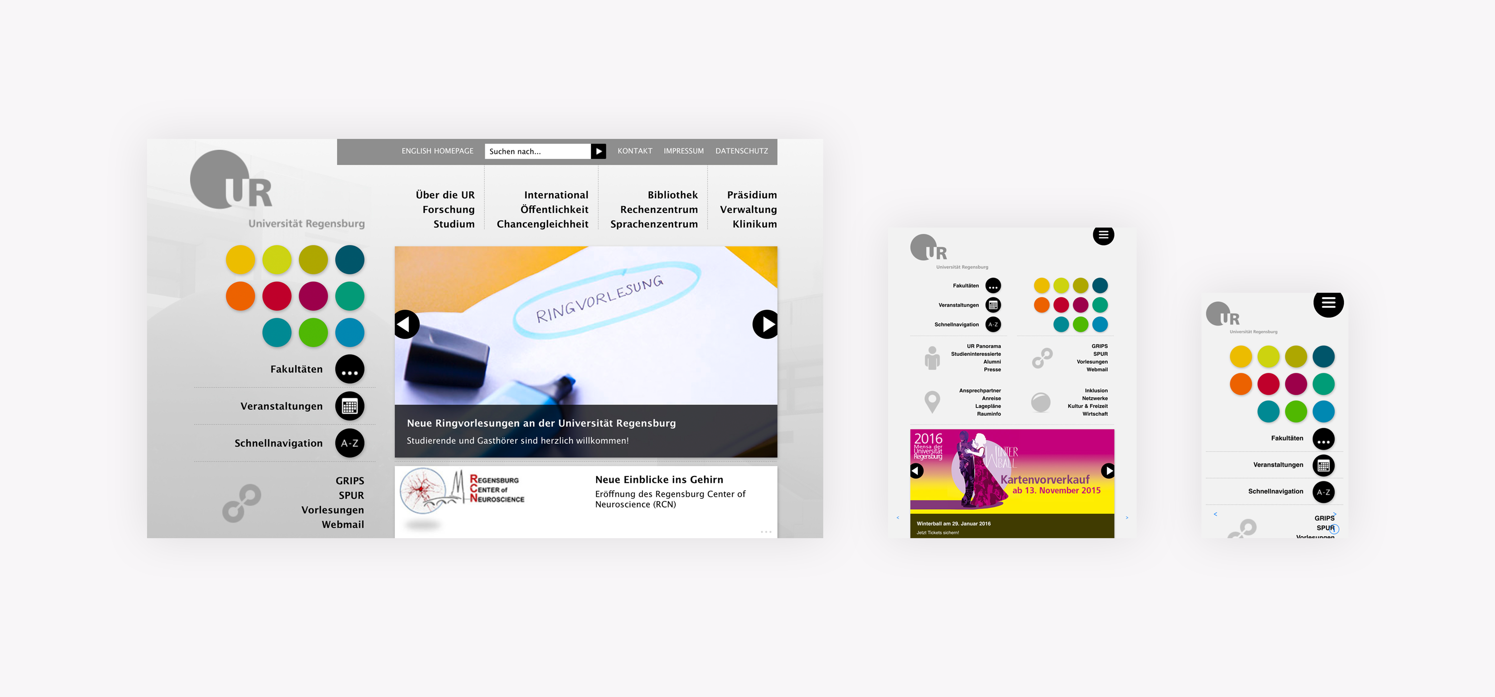
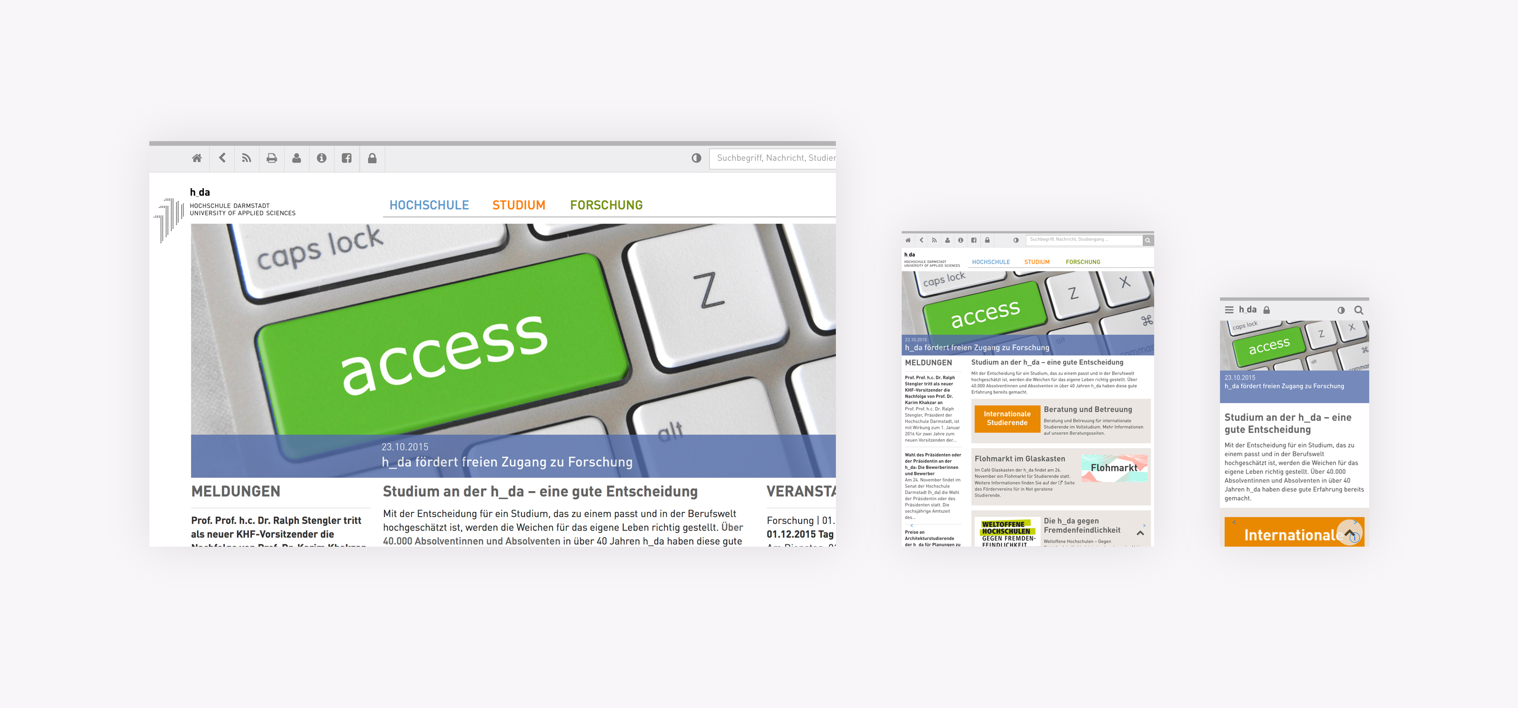
Qualitative evaluation of an aesthetically highly rated website itemized on the respective devices
Qualitative evaluation of an aesthetically low rated website itemized on the respective devices
Selected Works
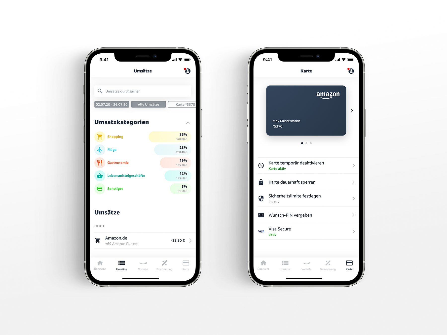
Amazon.de VISA CardAndroid, iOS, Web, Brand
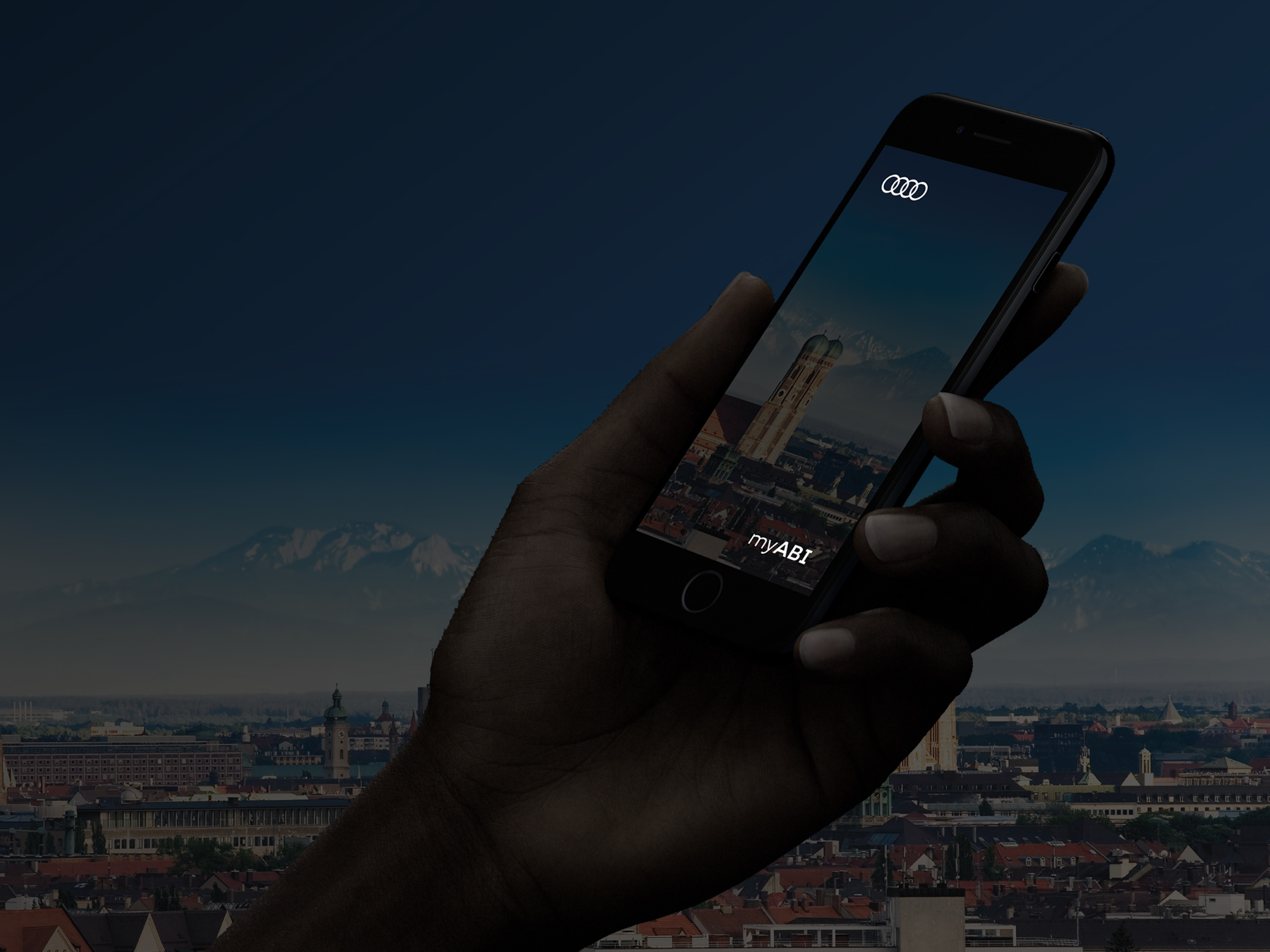
myABIWeb and iOS
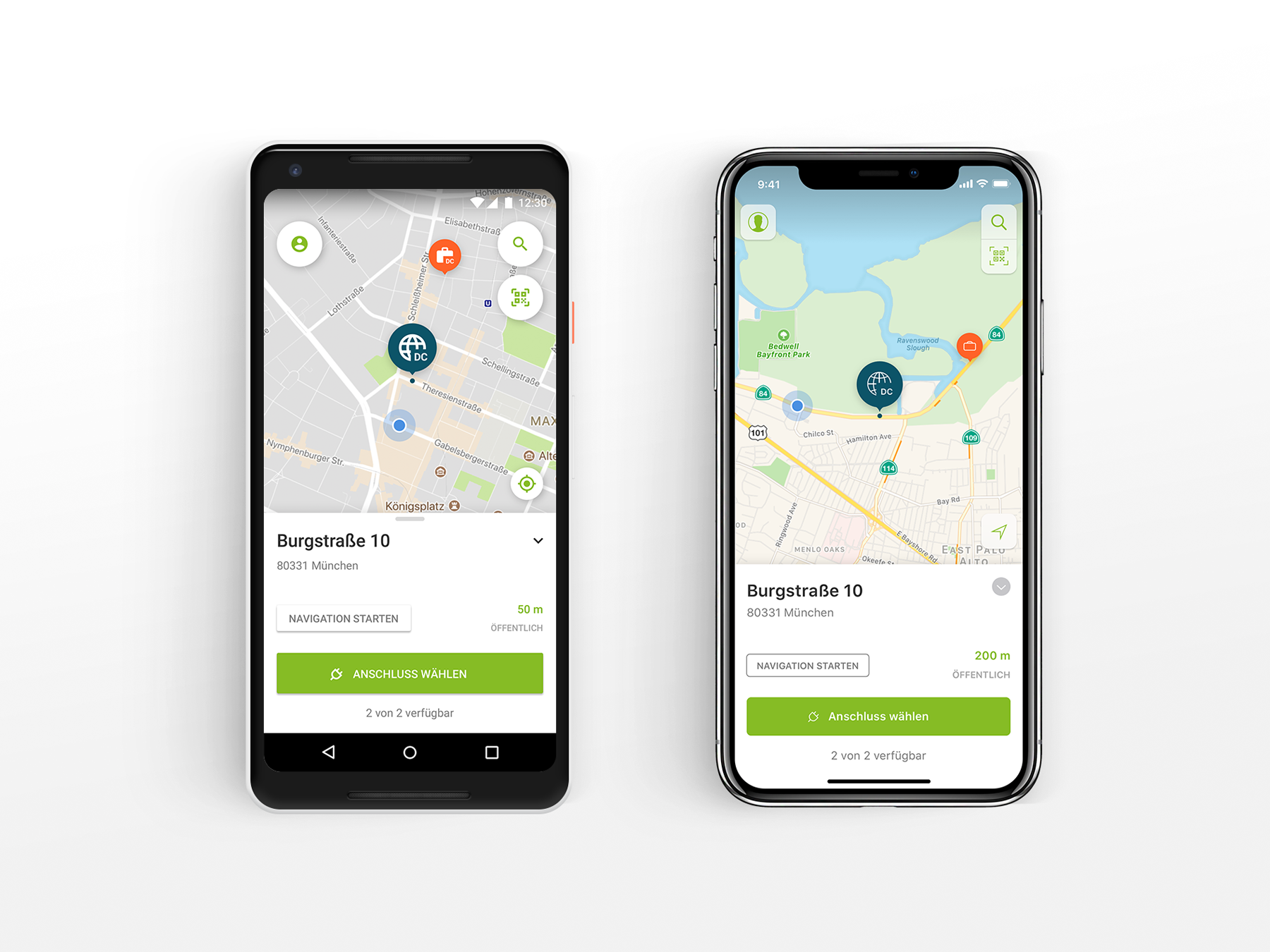
eeMobility Charging AppAndroid and iOS
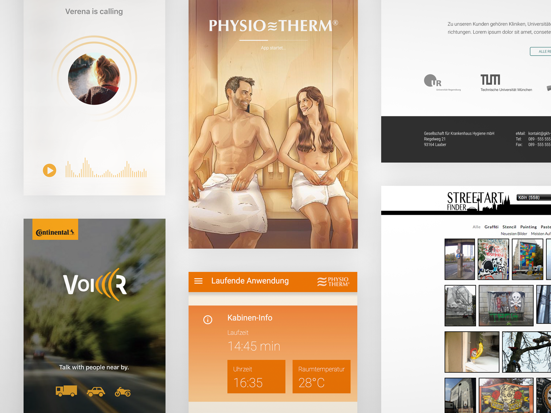
Misc ProjectsWeb and Mobile
Logo Designvarious
Master Thesis University of Regensburg